
Stuff’s headline this morning National Back on Track, got me thinking a bit more about poll bias. Partly because the Fairfax Ipsos poll seems to have much higher numbers for National, and also because of the nice work presented by Danyl with his “bias corrected” poll, Gavin White of UMR’s analysis, along with two other poll aggregators, that of a Wikipedia Editor, and also Rob Salmond at Polity.
This stuff is a little oblique to that. I’ve used the Wikipedia data scraping strategy, and then used ggplot2 in R to produce these (relatively untidy graphs). The black line represents a default loess smoother, and as well as plotting a line for each company, I’ve also plotted a default loess for each company. For National, it’s clear that (especially in recent times) Fairfax Ipsos is particularly bullish on National. Also, just note for later that the black overall fit tends to quite heavily mimic the dirty yellow line for Roy Morgan.

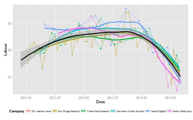
For Labour, what is most remarkable is how consistent (and negative) the trends are for all the lines. Note Fairfax Ipsos sticking out again recently.
The smallest party I’m going to plot is for the greens. Again note that the dirty yellow line is the same shape as the black line.

So why does the Roy Morgan profile seem to share the shape with the same overall trend? Something I’ve known, but hadn’t really considered as an influence before, is that Roy Morgan is by far the most regular and frequent poll. This means unless that is weighted out, it will always dominate the shape of the trend. And as far as I’m aware, none of the poll averaging strategies do that.
In conclusion
- Fairfax is a bit of an outlier (favouring National over Labour).
- Because Roy Morgan poll the most frequently, most attempts to aggregate over different polls will be overweight with Roy Morgan.
______________
And for any geeks, here is my ggplot2 code
ggplot(surveys, aes(Date, National)) +
geom_point(aes(shape = Company, colour = Company)) +
geom_line(aes(colour = Company)) +
geom_smooth(aes(colour = Company), method = “loess”,
se = FALSE, lwd = 1.5) +
geom_smooth(method = “loess”, colour = “black”, lwd = 1.5) +
theme_grey(18, “Gill Sans MT”) +
theme(legend.position = “bottom”, legend.text = element_text(size =10))

Thanks, this is useful.
At the cost of less accuracy earlier in the series, I’d make the smooth more sensitive. Movements in the last 6 weeks are more likely to be ‘real’ rather than sampling error.
I would also avoid downweighting RM, simply because as well as being most frequent, they also poll mobile phones. We don’t know how mobile-only or mobile-primarily individuals differ from the rest of the population, and the information those individuals provide is captured in RM polling.
Hi George,
I agree with your points. I would also prefer a more sensitive curve – the lack of response in the GAM in the current iteration of the wikipedia figures have made them less interesting to me.
I should probably have prefaced it however that my goal here was to look at long term trends by company, not to provide yet another poll of polls alternative. I don’t think I’d advocate downweight RM necessarily, but consider aggregating trends for each poll to partial out frequency effects, though in effect that would downweight RM. However, I also think there is something inherently interesting in looking at the polling companies individually to contextualise their polls. That is, I suspect that Ipsos is probably less accurate here.
Finally, having parted with the $$, I understand the economic incentive for Fairfax to run big headlines on their poll, even if I don’t think the conclusions are really warranted.
Wikipedia used a loess (span = 0.5) for 2011, but there was a lot of argument, possibly on teh Dimpost, and maybe on wikipedia as to what the value should be. I think especially in terms of varying it such that produced a wish fulfilment outcome (look, the line has turned [if we change the smoother to k])
The routine shifts of +-10% for National over short time periods show their 3.5% margin of error to be quite the … inaccurate statement … for a start. There’s only 62 Roy Morgan polls, they’re not allowed 6-10 outliers at 95%. Either the party support really does random walk a fair amount all the time in a way that just happens to correlate with the noise, or the margin of error is just wrong.
Like, give National a 5.5% margin to match the expected outliers and all of a sudden it’s just all noise. The R^2 on any shift being real is tiny, if you try to say there’s a real dip in late 2013 and a real rise mid 2014 it just generates more outliers.
Which is to say, you can’t prove polls are accurate by assuming they’re accurate. Like the Greens there flipping up and down 7% every couple weeks. Because no they aren’t. That’s a sign of an inaccurate polling system.
Which, if you apply that to Labour, their drop did eventually became real, after months of the press talking up the noise like it meant anything. Or are the polls only accurate when Labour’s result goes down? When Cameron Slater offers some dirt to the reporters to talk that up for a while. Surely not. Surely it’s not all dirty politics.
Pingback: What are polls-of-polls telling us? | Grumpollie