Teaching a conceptual research methods course online

This post will describe putting fully online the second half of a research methods course, in response to the COVID-19 pandemic. This course is a compulsory component of five allied health programmes: Professional Masters of Human Nutrition and Dietetics, Occupational Therapy, Physiotherapy, and Speech Language Therapy; as well as an undergraduate Bachelor of Physiotherapy.

These students are being prepared for practice as health professionals. For most of them, consuming research as opposed to producing it will be their primary concern in their careers (Harding et al. 2014). However, there is a clear desire to have clinicians more engaged with evidence-based practice (Slade, Philip, and Morris 2018). So my goal is for them to develop a good conceptual understanding of issues in relation to research methods, including ethical considerations, publication bias, power, and very basic quantitative and qualitative analysis.

The 140 students in the course will have disparate prior learning, especially for the Professional Masters students. Some students may have previously studied statistics or social sciences disciplines and thus have considerable expertise in research methods. Other students will come back to university study from backgrounds with very little or very different research methods training (e.g., education, engineering). An ideal design would take advantage of the interprofessional nature of the class, allowing them to learn with, from and about each other (WHO 2010) within their developing professional identities. Such learner to learner interaction (Anderson and Garrison 1998) was achieved in the blended delivery of the preceding module, but was not achieved here.

My original plan (pre COVID-19) was to briefly introduce and signpost to a variety of high-quality online resources, and then complement that with face to face tutorials. Instead, I have opted to use some of the originally planned online resources, but added asynchronous video lectures, real-time tutorials via Big Blue Button, the Sulis (Sakai*) forum feature, and constructed the signposting with the Lessons tool in Sulis. When choosing between asynchronous and synchronous delivery, I opted for a combination of both. As outlined in a relatively recent review, both types of interaction have their advantages, but a number of factors should be taken into consideration when choosing (Watts 2016). As some of the students had returned to overseas countries with substantial time differences, the medium-to-large class size, I opted to make the lecture-type materials available asynchronously, paired with synchronous tutorials in the late afternoon would suited almost all of the students.

Because of the sudden nature of the change, it was not possible to foreshadow the transition to online learning in a meaningful way. Typically, wrapping (Littlejohn and Pegler 2007) would be important to make blended learning seem blended in a seamless fashion. And obviously after March 20, there was no further face-to-face learning, so it was became a fully online/distance experience, rather than blended. To attempt some form of wrapping/scaffolding, I used the Lessons tool in Sulis.

Screenshot of lesson page and streamlined menu

For each week of teaching, I created a new lesson page, available in the main menu on the left, clearly titled, so that students did not have to dig to find content. I also deliberately disabled the “resources folder” feature, which tends to become a bucket of doom, where all content is held, but not in an easy to navigate fashion. Each week, the lesson page had some text introduction, introducing and ideally integrating various online resources. It was also possible to use this to highlight for some students where it might have been covered in their prior learning (these are masters students). There was also links and some more advance content for those students wanting to take it further. All the materials for the course were self-contained in the lessons page, and the assignments, quizzes, forums etc., were also linked through from the pages. Even the timetable and course handbook were included not as resources or announcements, but on the Overview landing page, when entering the site for the course, which then matches the Lesson pages in the left-hand menu. In the future, it would be also possible to link them directly from the timetable as well.

Overview page with lesson timetable and course handbook

The most challenging week was for what would usually be a hands-on tutorial, and the original key part of project. I broke down the tutorial elements into very small discrete segments and provided walk-through materials in small chunks, both in a PDF with screenshots, and also as a video. Following this, students had a small formative exercise to implement these new skills. They were able to self-check their results by using a formative quiz on Sulis which would confirm whether they had the correct answer, along with guidance on how to get it. Formative-only assessment may not always give the same levels of engagement (see e.g., Heitin 2015), but these students had prior experience of my teaching in the previous semester where similar formative-only assessment was used.

Description of formative exercise and assessment on lesson page with link to quiz to check answers.

The sudden nature of the change meant that the choice of tools was largely utilitarian. Sulis is UL’s default virtual learning environment. It contains a range of features with which students are already mostly familiar. This means less to no support or induction was required. Big Blue Button – a virtual classroom tool – is integrated within Sulis so was an obvious choice. From a backend perspective, my prior experience of making videos as a narrated PowerPoint was relatively low quality. To this end, I experimented with a number of different platforms. Video recording was chiefly with OBS, and I either recorded my audio there, or with Audacity. Despite not having a great microphone (I immediately switched to using a standalone webcam microphone in preference to the built in microphone on my laptop), I was able to improve the sound quality substantially in Audacity. A further technological limitation was my institutional laptop, which has no GPU, and it rapidly became apparent that this was an issue for video-editing. I was also very lucky to have a dual screen set-up which meant that I was easily able to control recording and also the picture at the same time.

Preparing to record a Jamovi statistics session using OBS

Due to the COVID-19 situation, we were mandated to streamline course assessment, and therefore the course assessment was unrelated to the online content. However, support for that assessment was delivered through forum posts and two Big Blue Button sessions. The Big Blue Button sessions proved particularly popular, with over half the class online, and a steady stream of questions and discussion for over an hour.

The engagement, based on Sulis analytics seems good. For example, on April 20, when I launched the final week’s content, there was almost 400 visits to the lesson page, not quite three per student in the course (n=140). Overall, the engagement seemed reasonable in a cohort going through a great deal of unexpected change, with well over 6000 site visits by students. Unfortunately I have little in the way of qualitative feedback, of the students experience of the process. A number of students engaged with me via email with questions in relation to the quantitative analysis tutorial, and based on the quality/content of their questions, seems like they were getting something out of it. Looking at the students’ answers to this formative assessment, it seemed bimodal, with students either getting all or nearly all the answers correct, or having quite a bit of difficulty. In future, it would be useful to see if this was as a function of their prior experience, or if there are ways that I can adapt and adjust this to better scaffold the students through the materials. One obvious future option would be to have more re-cap questions through the exercise, so that students have more opportunity to self test before they get to the end. Ideally, however, this would be part of the course that would run face-to-face in the future.

This innovation embraced Open Pedagogy in several ways. Hegarty (2015) outlines 8 attributes of Open Pedagogy, and this has embraced three of those: sharing ideas and resources, peer review, and reflective practice. The original plan (since adjusted) received peer review through the teaching and learning qualification I am enrolled in, and in producing this blog post, I am engaging in reflective practice. This project drew on a variety of open education materials and learning architecture. Both Sakai (Sulis) and Big Blue Button are open source software, as is Jamovi, the statistical software taught in class. That software in turn comes with a statistics textbook available free on the internet with a CC-BY-SA licence. For the construction of the course, OBS and Audacity are free open source source, only for the video editing did I have to use proprietary software, as well as the ubiquitous Microsoft Office package. I have previously shared some of my teaching materials from this course (on power and publication bias) with colleagues from other universities. Once they are more polished, I would be happy to openly sure them with a permissive license for re-use. And the high quality teaching materials I drew on from elsewhere were similarly licensed and used under permissive licenses.

Taken together, I was happy with how the course ran, and will be retaining a number of these elements, even when we are once again able to teach face-to-face. Should you have more questions or comments, feel free to leave a comment below!

Here is a video demonstrating a bit more of the approach:

_________

*Sakai is a free open source virtual learning environment, which has been adapted and re-branded as Sulis at my institution.

_________

Anderson, Terry, and D. Randy Garrison. 1998. ‘Learning in a Networked World: New Roles and Responsibilties’. in Distance Learners in Higher Education: Institutional responses for quality outcomes. Madison, WI: Atwood.

Harding, Katherine, Judi Porter, Anne Horne-Thompson, Euan Donley, and Nicholas Taylor. 2014. ‘Not Enough Time or a Low Priority? Barriers to Evidence-Based Practice for Allied Health Clinicians’. Journal of Continuing Education in the Health Professions 34(4):224–31.

Hegarty, Bronwyn. 2015. ‘Attributes of Open Pedagogy: A Model for Using Open Educational Resources’. Educational Technology 55(4):3–13.

Heitin, Liana. 2015. ‘Should Formative Assessments Be Graded? – Education Week’. Education Week, November 11.

Littlejohn, Allison, and Chris Pegler. 2007. Preparing for Blended E-Learning. Abingdon, UK: Routledge.

Slade, Susan C., Kathleen Philip, and Meg E. Morris. 2018. ‘Frameworks for Embedding a Research Culture in Allied Health Practice: A Rapid Review’. Health Research Policy and Systems 16(1):29.

Watts, Lynette. 2016. ‘Synchronous and Asynchronous Communication in Distance Learning: A Review of the Literature.’ Quarterly Review of Distance Education 17(1):23–32.

WHO. 2010. ‘Framework for Action on Interprofessional Education and Collaborative Practice’. WHO. Retrieved 4 November 2019 (http://www.who.int/hrh/resources/framework_action/en/).


Posted in Uncategorized | Leave a comment

Dunedin Central Ward Elections 2016

So the preliminary election results out, and Dunedin uses the Single Transferable Vote system. This is both fiendishly complicated to calculate the outcome, and also potentially quite frustrating for voters. On the flip side, it is supposed to produce a fairer outcome, and more diverse representation.

I like graphs, so this depicts the outcome. Basically, they count the votes, eliminate the weakest candidate, and the the people that voted for that person, their vote transfers to the person they like next best, and so on, along the bottom of the graph, until 14 councillors have been elected.

dunedin2016-v3

So as you can see Vandervis was by far the most popular candidate (though had Cull not been elected Mayor, then he would have been, I suspect). Whiley, Hawkins, and Benson-Pope all got there on first preferences, with Staynes getting in after the first 10 or so weakest candidates had been removed. The next few councillors all get elected in a mostly unsurprising fashion, until we get to Laufiso and Garey. These candidates were originally pretty equal of first preferences back at iteration 1, but both pull away from other candidates that they start out with back on the left hand side.

In particular, you’ll note that Laufiso picks up quite a few additional votes (marked 2) when Matahaere-Atariki, Walker, and Fung. This suggests that voters that liked those candidates also like Laufiso. You can also see a number of candidates whose elimination gives Hawkins a real bump (marked 1) even though he is already elected (those bumps are then redistributed).

Barbour-Evans could be described as unlucky, but in reality, as the final candidates were eliminated, they did not benefit as much. (It doesn’t seem too surprising that Acklin supporters don’t overlap with Barbour-Evans supporters).

I don’t expect there will be any change from the provisional results. There are no other candidates close, and I don’t think a different ordering of eliminations would have an impact.

(Except, perhaps if Fung was marginally ahead of Garey. At that point, it is between Garey, Fung, Barbour-Evans and Acklin. Garey gets a big bump after Fung is eliminated. At that point there is 25 votes in it. If Fung was ahead of Garey, and her elimination pushed either Fung or Barbour-Evans forward, they could replace Garey on council. Based on the patterns there, Acklin does not seem likely to benefit from this scenario).

(Also, it’s not very visible, but Acklin is also only 24 votes ahead of Walker at the point that Walker is eliminated. Hard to predict what would happen from there).

Posted in Uncategorized | Leave a comment

Is solar generation increasing? (Yes) The perils of cumulative totals

This graph was tweeted by Greenpeace

Which immediately brought me back to a recent Stats Chat post on cumulative totals. Cumulative totals tend to go up. And on the face of it, it doesn’t really look like growth has been accelerating recently. Growing yes, but not “skyrocketing”.

I followed up on the post, and found the original data here. Turns out it’s quite a bad graph. It’s not installed solar capacity (as the label says), but rather solar generation. Though that at least explains why the value dropped in 2012 – it’s possible that generation could decrease (less sun?), but it would seem strange that lots of people would uninstall solar panels. Worse, it turns out that they are only using real data until 2013, and the 2014 and 2015 numbers are projected.

So here is a more accurate version of the graph (dotted are estimated figures)

production

But if you were to draw a line through 2009-17, it doesn’t really look like exponential “skyrocketing” growth, only linear straight-line growth.

And if you plot the annual increase, not such a flash picture emerges.

increase

Solar generation is definitely increasing (a good thing), but not skyrocketing.

UPDATE – One of the important things about being a scientist is that in the face of new information you should always re-evaluate your position. So it turns out that my conclusion was wrong. Solar installations are increasing exponentially. The data in the original greenpeace graphs was production as in fabrication, not generation. My bad. But still *not* installations.

So here is the actual world installed solar capacity.

install

It is pretty hard to tell whether that is actually just a straight line, or if the rate of installation is continuing to increase. So here is rate of annual installation.

inc

So rather cheeringly, solar installations are skyrocketing.

Posted in Uncategorized | Leave a comment

No to faster motorway speeds.

Driving fast is fun. I’ve enjoyed Italian and French motorways at 130km/h, and the Germany Autobahn at the maximum speed attainable by the small Nissan I was driving (~190km/h).

But is it a good idea? For new motorways in New Zealand?

Assuming a car was able to travel at *exactly* the speed limit, the time savings for travelling 10km would be 33 seconds off a 6 minute trip. That doesn’t seem entirely bad. But in some sort of real world analysis (not formally published) a change of limit of 10mph led to an actual increase of only 3-4mph (author information here), so I think it is safe to assume the real world time savings might be less.

Assuming incrementally New Zealand continued to increase the quality of roads, an increased speed limit would save you 2 minutes 21 seconds from the start of the Northern Gateway to the Auckland central motorway junction (CMJ, 43km), assuming, haha, no congestion. Or all the way through to Pokeno (95km) 5min 11 sec. Or if Auckland CMJ to Hamilton was one long stretch of 110km/h. Savings 6 minutes 26 seconds. In. No. Traffic.

If that isn’t bad enough, most negative events associated with driving increase exponentially rather than linearly with increasing speed. So we have a nominal increase of 10% in the speed limit, but potentially less than 5% actual speed increase, but with more than 10% increase in fuel consumption, and a higher than 10% likely increase in crashes and fatalities.

Oh, and having vehicles travelling faster actually means less cars able to fit on the road, so more congestion.

In international contexts, truck drivers are not interested in travelling faster, realising that the miniscule time savings are more than outweighed by the increased fuel consumption.

Posted in Uncategorized | Leave a comment

More rambling on polls & bias (UPDATED)

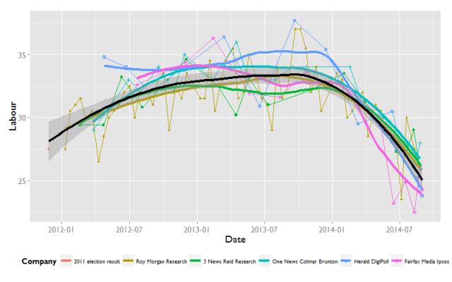
I should clarify that my post yesterday was not intended to produce another poll of polls, but to explore differences between polling companies. As one commenter suggested, making a line more sensitive would probably be more interesting/useful for a poll of polls.

And as I eventually realised, with Roy Morgan contributing over half the poll results, it does weigh heavily on the poll of polls. With those two thoughts in mind, I’ve removed Roy Morgan from this chart, and also added a Loess (span = 0.5), which was the sensitivity used in the Wikipedia charts for the 2011 election.

As you can see, the more sensitive line does certainly vary more, and certainly counters Stuff’s headline yesterday suggesting that National were bouncing back. It’s also really obvious here just how high the Fairfax Ipsos (pink dots) is compared to most of the rest of the polls at the moment. Interestingly, at this point in the last election, it was the Roy Morgan poll that seemed to be tracking much higher for National.

This is perhaps the attraction of producing some sort of poll of polls, but trying to correct for the polling frequency, so that the average isn’t over influenced by polling frequency makes sense. I didn’t mention David Farrar’s rolling average of polls yesterday (probably because it isn’t presented as a graph), but this close to an election, he only uses the last poll, so those figures would not be influenced by that. Some discussion yesterday on this, and the suggestion that Roy Morgan ought to perhaps be overweight, as it does add more information, because it is more regular. However, perhaps an alternative would be average each polls trend. Pictured below are loess(0.5) by polling company. Interestingly, they don’t as a rule particularly follow each other, though (again in contrast to the Fairfax headline yesterday), do suggest that National’s support is softening.

Finally, back to bias, Russel Brown, on twitter, asked about how my figures would look for the smaller parties.

Fairfax have been low on NZ First (corresponding to their being high on National?). Roy Morgan again driving the trend, and with the highest estimates for NZ First.

3 News Reid Research have the highest estimates for the Conservatives overall. This is one where Roy Morgan don’t dominate, and they don’t seem to have detected the uptick in support that all the other polls have seen recently.

Not enough data points really

Definitely trending down.

Not much to say here, other than that this make’s Roy Morgan’s policy to round to 0.5 percent (and 1 percent for larger parties) really obvious, relative to the other pollsters.

So final *bias* summary

  1. Fairfax are high on National, seemingly at the expense of NZ First
  2. Roy Morgan are higher on Labour and the Greens, seemingly at the expense of National.

UPDATE: The point I meant to make this morning (but forgot)

It seems reasonable to me that there will be systematic quirks in each firms polling methodology (handily outlined here). Combined with changes over time in the population, and perhaps polling companies changing their methods (eg to try to increas response rates), there ought to be some variance attributable to the polling company. Trying to work out whose is “right” is a fool’s errand, but attempting to account and model for it seems like a good plan.


Posted in Uncategorized | Leave a comment

Thoughts on poll bias

Stuff’s headline this morning National Back on Track, got me thinking a bit more about poll bias. Partly because the Fairfax Ipsos poll seems to have much higher numbers for National, and also because of the nice work presented by Danyl with his “bias corrected” poll, Gavin White of UMR’s analysis, along with two other poll aggregators, that of a Wikipedia Editor, and also Rob Salmond at Polity.

This stuff is a little oblique to that. I’ve used the Wikipedia data scraping strategy, and then used ggplot2 in R to produce these (relatively untidy graphs). The black line represents a default loess smoother, and as well as plotting a line for each company, I’ve also plotted a default loess for each company. For National, it’s clear that (especially in recent times) Fairfax Ipsos is particularly bullish on National. Also, just note for later that the black overall fit tends to quite heavily mimic the dirty yellow line for Roy Morgan.

For Labour, what is most remarkable is how consistent (and negative) the trends are for all the lines. Note Fairfax Ipsos sticking out again recently.

The smallest party I’m going to plot is for the greens. Again note that the dirty yellow line is the same shape as the black line.

So why does the Roy Morgan profile seem to share the shape with the same overall trend? Something I’ve known, but hadn’t really considered as an influence before, is that Roy Morgan is by far the most regular and frequent poll. This means unless that is weighted out, it will always dominate the shape of the trend. And as far as I’m aware, none of the poll averaging strategies do that.

In conclusion

  1. Fairfax is a bit of an outlier (favouring National over Labour).
  2. Because Roy Morgan poll the most frequently, most attempts to aggregate over different polls will be overweight with Roy Morgan.

______________

And for any geeks, here is my ggplot2 code

ggplot(surveys, aes(Date, National)) +
     geom_point(aes(shape = Company, colour = Company)) +
     geom_line(aes(colour = Company)) +
     geom_smooth(aes(colour = Company), method = “loess”,
     se = FALSE, lwd = 1.5) +
     geom_smooth(method = “loess”, colour = “black”, lwd = 1.5) +
    theme_grey(18, “Gill Sans MT”) +
    theme(legend.position = “bottom”, legend.text = element_text(size =10))

Posted in Uncategorized | 5 Comments

Drain Water Heat Recovery – We’ve ordered one!

Three years ago, I wrote about my discovery of drain water heat recovery (also known as grey water heat recovery). Simply put, they appear to offer the same energy savings as a solar hot water system, but for a tiny fraction of the price. I read up on it quite a bit. They are well supported overseas, and there are plenty on the market internationally. So when the opportunity arose to purchase one, I looked at the two locally available examples, and picked the one that was able to be installed vertically, the EnergyDrain. Being locally made, and cheaper also helped in the decision.

Figure 1: Figure EnergyDrain

Despite some semi-effortful attempts, in my background reading, I hadn’t come across any criticism. So I went ahead and ordered one. However, semi-fatefully, a week or so after placing the order, I mentioned this systems in a forum discussing solar water heating, and David Haywood (wearing his engineering hat) said:

I’ve done heaps of modelling on these systems and they are good in theory. The problem is the HX cost and the cleaning. Most systems use some sort of horrible draino-type stuff every few weeks.

And went on to be explicitly critical of the horizontally installed ones. The more expensive GFX that I ruled out, seems much less prone to fouling, but that is due to its vertical installation, which isn’t possible for our house.

The main problem is that the building up of scum inside the heat exchanger will reduce its efficiency; though I’m not sure if it will ever meant that efficiency reduces to zero. Anyway, we’ve bought one, it’s arriving any day now, so I think it’s worth quantifying whether we will see much in the way of savings, and whether scum build-up is an issue.

Fortuitously, once the system has been installed, we will switch our hot water cylinder onto night rate, which is separately metered, so our energy consumption for hot water will be easily measured.

In order to accurately estimate the savings, I plan to have the plumber install a bypass loop round the heat exchanger, as well as a Y-regular joint, with an inspection opening, as illustrated below

To answer the first question, what are the real-world savings, if any, I’ll use an ABBA design, as illustrated below. I’ll route the cold water through the bypass for a week, then two consecutive weeks with the heat exchanger (HXC) in operation, followed by a week with the bypass back on. The advantage of the ABBA design is that if there are any other variables changing over time, affecting our hot water energy use (eg, changes in the weather, the system getting dirtier), this should cancel it out. Efficiency can then be estimated as the ratio of energy decrease during B divided by energy used during A (here (15-10)/15 = 33%).

Then, to assess the influence of dirtiness, I can plot energy use over time, and then occasionally clean it out. My faked data below would suggest that most energy savings is lost after 90 days (dotted lines indicate cleaning, and here the efficiency declines, so kW used increases), so would suggest cleaning rather more frequently. Obviously, I secretly hope for data that does not look like this, as it would imply that I should clean it every month or two.

Obviously, I’d be much happier if it looked something like this, with the efficiency declining a bit, then plateauing.

Welcome any feedback on my design, and otherwise, I guess there will be an update in a month or two.

Posted in Uncategorized | 1 Comment

Roy Morgan predicting National landslide?

UPDATE: This post was written early yesterday (Monday), but I chickened out of posting it, because I thought it was too much of a ballsy call. However, Roy Morgan are themselves making the call, so I think it is worthy of discussion. In particular, because this is not a recent change, but part of a consistent pattern for them.

The Herald Digipoll, ONE News Colmar Brunton, Fairfax-Research International, and 3 News Reid Research are all showing support for National dropping, but Roy Morgan has National support steady, and comfortably above 50%.

Polls are invariably reported with their Margin of Error, an estimate of the precision for a party with exactly 50% support. The Margin of Error is not very useful for comparing whether there is a difference between two parties, and it certainly is no use at all for considering change over time. And change over time ought to be what we are interested in. Is support for Party X climbing or dropping?

One crude way of doing this is to add a line fitted through the datapoints, but one of the hidden aspects of variation, as I tried to illustrate on Friday is that different polls will use slightly different methods, which may mean that that poll produces consistently different results in a certain direction. As I noted then, Roy Morgan generally shows lower support for National. However, over the last month, the other polling companies have all shown a clear drop, while Roy Morgan have had National’s support climbing.

Roy Morgan sample over a week to a fortnight, which could explain them being slower to catch on to this most recent trend. Alternatively, it may be that some particular element of their survey method is producing a consistently different result for them. This is brave: if they are proved right on election night, it could be that their method is superior. If they are wrong, then they may want to reconsider how they are polling. Irrespective of the outcome, however, it brings me back to a recent summary of Daniel Kahneman’s work looking at the success of fund managers: whoever is most successful in a given year (or election?) may just be due to chance.

UPDATE 2: The downward trend exists for the other 3 polls, but because Fairfax Research International and Herald Digipoll have relatively few data points, it is hard to display in a tidy fashion. Also, Roy Morgan’s trend does not diverge in the same way for Labour and the Greens, only National.

The data is derived from wikipedia, and fit with a modified version of the graph there, using a LOESS fit, with a span value of 0.3.

Posted in Uncategorized | 1 Comment

Reading the Political Tea Leaves

Despite mentioning tea in the title, this post is about opinion polls, not the ACT of drinking tea.

There are a number of sites that maintain graphs of New Zealand political polls, notably Rob Salmond at Pundit and, curiously, Wikipedia. Wikipedia post their data in tabular form, and provide the code for R underlying the creation of their graphs, allowing anyone with certain degree of geek cred to have a hack (ie, me). Yesterday, someone on wikipedia requested an updated version focussing only on more recent polls, which I had a go at, including making the fit line a bit more sensitive to change.

Changing the sensitivity of the fit line, makes it seem like there more movement than there has been in a while, and this graph was subsequently featured on the DimPost and then the Listener.

The next question was about whether the different polling parties differentially contribute to such a rolling poll. Their sample sizes are pretty uniform, at around 800. Roy Morgan contribute over half (68 of 121) with their poll regularly conducted over several days. 3 News Reid Research have fewer polls (16) but all conducted on a single day.

But how do the different parties fare in the polls (in order of polling).

Firstly, you can really get a sense from this graphic how much more regular Roy Morgan are, and their estimates are pretty consistently low, relative to the other pollsters. 3 News Reid Research is fairly consistently high. However, in the latest few polls, they have had some lower numbers for National.

3 News Reid Research is consistently lower on Labour, which combined with the above, suggests they favour National relative to the other pollsters. The Herald Digipoll has higher values for Labour most of the time.

The Herald Digipoll and ONE News Colmar Brunton are consistently lower for the Greens than other pollsters. However, in the most recnet polls, Herald Digipoll and ONE News Colmar Brunton both show much higher numbers than usual for the Greens.

(Lame) SUMMARY:

  • There is definitely variation attributable to the pollsters.
  • It does seem like there is some change, at least with the polls. Whether this translates to anything meaningful for next Saturday, who knows. I plan to add ACT and NZ First later for completeness.
Posted in Uncategorized | Leave a comment

Warmth from the sun

The other week, Cr Fliss Butcher suggested that there should be a ban on south-facing homes in Dunedin. Predictably (as can be seen in the comments thread in the link), this has been met with a hail of derision, but also some support. Personally, I think New Zealand building standards seem to be always out of date. Houses that were built as little as 10 years ago seem embarrassingly bad by current standards because of this. It was only in 2008 that double glazing became sort of mandatory, and many houses from the 90s (and some even up until 2008) have embarrassingly little insulation.

There are already rules on south, east and west facing glazing; if a house has more than 30% of its glazing on these walls, thermal modelling is required. This seems a more nuanced approach than simply banning south-facing homes. However, as always it seems that the rules could be more aggressive. I think that if you can afford to build a new house, then you can afford to spend a little more money to make sure that you are building a real asset. In essence, if you are going to build a new house in Dunedin, you may as well build a bloody warm one.

Research in Dunedin by economist Dr Paul Thorsnes backs this up. Houses built after 1978 (when insulation first became compulsory), command a hefty price premium relative to pre-insulation era houses. Similarly, houses that receive more sun in mid-winter are worth more than houses that receive less sun. This effect is particularly profound for pre-insulation era houses; a 3.9% increase for each additional hour of mid-winter sun. Perhaps unsurprisingly, Thorsnes lives in a sun-trap property.

But this is also a tale of how far we have come. When Austrian refugee architect Ernst Plischke designed a house in Christchurch c.1940, it was initially rejected because it did not have any* south facing windows. The issue was, of course, that the street was to the south, and under the rules of the time, the house had to address the street. The solution was eventually to add a few windows.

Fast forward 50-60 years, and the idea of an L-shaped house, opening to the sun and an outdoor living space is now taken as an almost given. The design seems surprisingly contemporary, as do some of Plischke’s other designs, such as the house he designed for Bill Sutch in Wellington, below.

*I’m pretty sure the design actually had none, and that he added some small windows, but I’m having to rely on my memory of this exhibition: ERNST PLISCHKE – ARCHITECT, City Gallery, Wellington, 5 September-28 November 2004.

Posted in Uncategorized | 4 Comments